Yield Curve
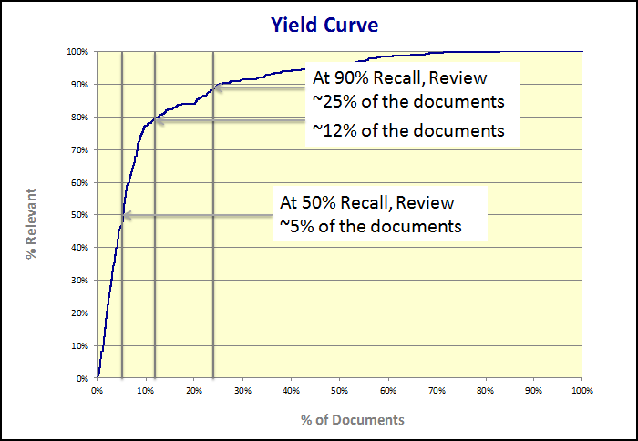
The yield curve is only available after the documents are reviewed and released from the Systematic Random stage. This is the chart that is used to represent the ranking results. From this graph, you can determine your next steps. Do you want to cut off the review at a certain point and discard some of the collection as non-relevant?
In the following chart, responsiveness appears on the y-axis, and percentage of documents reviewed appears on the x-axis. Because the documents have been ranked and re-ranked, the curve illustrates that at the beginning of the project, the recall increases quickly and steadily rises. This is because Predict has ordered and fed the documents to the reviewers with the most likely relevant ones first. The review team is finding relevant documents. As the review gets farther along, there becomes a point at which the curve starts leveling off. After a high rate of recall is reached, more and more non-relevant documents start being reviewed.
The purpose of using Predict is to determine where you can cut off the review with the goal of reviewing fewer documents. At some point, when you start to notice the review team is reviewing fewer relevant documents, you can stop (or cut off) the review. Using the yield curve and the associated calculations, you can select a cutoff point and analyze the results.

In Insight Predict, the yield curve looks like this:
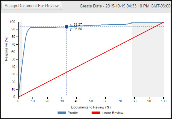
The red line represents what a yield curve would look like with a pure linear review. This allows you to compare the difference between using Predict and running a linear review project.
The blue line is the yield curve for the current project, after the Systematic Random stage is complete. The areas on the left and right that are gray, represent the portion of the collection that is already reviewed. Select a cutoff point by dragging the circle on the graph left or right. If you click the circle, the point will stick on that spot in the graph.
Notice the values to the right of the curve. These are calculated from the point you selected on the yield curve.
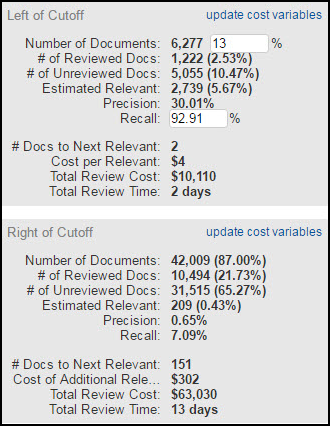
The numbers in these charts will help you to make important decisions and determine the appropriate cutoff point for your review. Typically, you will continue to review the documents that appear on the left side of the cutoff point, with the goal of reviewing fewer, but more relevant documents. Those documents that appear on the right side of the point are documents that you will likely not produce; you might choose to discard them completely.
Left of Cutoff
The numbers that appear in the Left of Cutoff section of the page will change, based on your selected cutoff point. As you can see, when you move the point, the numbers change.
Number of Documents: The number of documents that appear on the left side of the curve. The previous example shows that from the entire project population, we have selected that the cutoff be 13% of the population. This is the percentage of the collection that we intend to review. Note that you can insert a percentage into the box in order to see what percent recall you will arrive at, given a particular percentage of the population reviewed.
# of Reviewed Docs: The number of documents that have been reviewed and appear to the left of the cutoff point.
# of Unreviewed Docs: The number of documents that are not yet reviewed and appear to the left of the cutoff point.
Estimated Relevant: The estimated number of relevant documents of those to be reviewed and appear to the left of the cutoff point.
Precision: Precision is the percentage of relevant documents from the documents that have been retrieved for the Systematic Random sample. This is a measure of accuracy or correctness (the number of documents relevant, divided by the number of documents retrieved in the Systematic sample). It answers the question, “How much of what I retrieved was relevant?” Higher precision means that less time is spent on false positives.
Recall: Recall is the percentage of relevant documents that have been reviewed in the stage and is a measure of completeness (the number of documents reviewed, divided by the number of relevant documents from the Systematic sample). Recall answers the question, “How many of the responsive documents did I find?” If this number is low, too many relevant documents might have been missed. Note that as with the Number of Documents, you can insert a particular recall percentage. This is useful in situations where you have agreed with opposing counsel on a set recall figure. The other calculations will update, allowing you to plan your resources accordingly.
# Docs per Relevant: The number of documents divided by the estimated relevant for the left side of the cutoff.
Cost per Relevant: This is the total review cost that you will incur for every relevant document. For example, if the irrelevant-to-relevant ratio is 3:1. You pay to review three documents for every one that is relevant. You can adjust this figure by clicking Update Cost Variables.
Total Review Cost: The cost to review all of the documents that appear on the left of the curve. You can adjust this figure by clicking Update Cost Variables.
Total Review Time: The time it will take to review the documents that appear on the left of cutoff. Total Review time is the calculated by taking the number of documents on the left, dividing it by the documents per hour, multiplied by the number of reviewers, multiplied by the number of hours worked per day. Again, these calculations depend on the cost variables.
Update Cost Variables
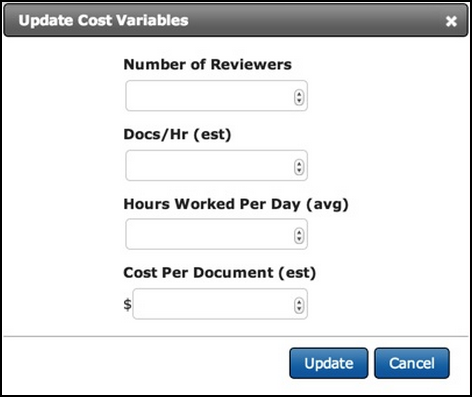
Select this link to change the cost variables from the defaults. A dialog box will open and you can change the information for the number of reviewers, docs per hour, hours worked per day and the cost per document. If you change any of these, it will store the information you input so you can use it again.
Right of Cutoff
The information presented in this chart allows you to see the cost and time associated with the documents you choose to be on the right side of the yield curve and are usually the documents that you choose not to review. Use the slide bar to change the cutoff and see the difference in cost.
The information tracked here is similar to the information tracked in the Left of Cutoff section of the page, but it pertains to the documents that appear on the right side of the cutoff.
These two calculations are different:
# Docs to Next Relevant: The number of documents you would have to review before getting to the next relevant document (the number of documents that appear on the right side of the curve, divided by the number of estimated relevant documents that appear on the right side of the cutoff).
Cost of Additional Relevant: This is the cost of reviewing documents to get to the next relevant document (the number of documents to next relevant times the cost per document).
This figure is similar to the Cost Per Relevant figure from Left of Cutoff, but the number of relevant documents on the right should be sparse. Therefore, the irrelevant-to-relevant ratio should be high. For example, if the irrelevant-to-relevant ratio is 100:1, you pay for reviewing 100 documents for every one relevant document.
If there is one relevant document in every 100, and the cost for reviewing each document is $3, then the cost per relevant document is $300. So, you can see that it is an exorbitant cost to review all of the non-relevant documents just to get to the next relevant one. It is better to exclude the right side documents from review and production.
the right side documents from review and production.
Not Ranked Documents
The number of Not Ranked documents appears in the upper right corner, above the Left of Cutoff chart. It shows the number of documents (and percentage of the population) that was excluded from the ranking process. Documents might not be ranked for a variety of reasons, including file size and document content (e.g. - empty documents, documents with only numbers, documents greater than 10MB of text), are excluded from the process completely.
Click on the Not Ranked link to bring back the non-ranked documents in a table. You can, and should, review those independently.
Rejecting the Yield Curve (Continue Ranking)
After the Systematic stage is complete and all documents have been reviewed and released, you determine whether to accept or reject the yield curve.
If you believe that additional sampling and system training is needed, click the Continue Ranking button located above the curve.
If you choose to reject the yield curve and continue to train the system, the other stages of the project will be enabled once again. The documents that were coded in the Systematic stage will be automatically sent to ranking as document seeds.
Productivity and Coding Distribution Reports
Additional reports are available to track productivity and coding distribution.
To open the Productivity Report, click Reports in the left panel. You can customize the report by selecting all stages or by selecting just one stage, such as the QC stage or the Systematic Random stage.
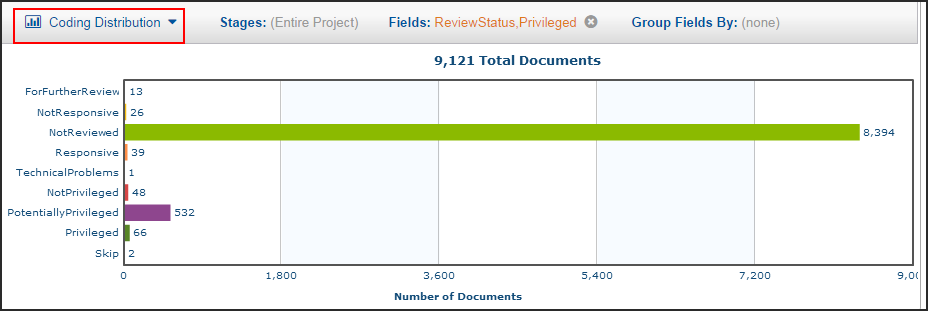
Click Coding Distribution to see the decision field on which the project is based.
